
Contents
- Course Filter
- Grid Course
- Stop and Go
- Grid News
- Grid Event
- Grid Profile
- Carousel Campus
- Carousel Course
- Carousel Project
- Carousel Event
- Carosel Profile
- Carousel News
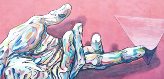
- Image Text Hero
- Link Box
- Standard Content
- Standard Content with Table
- Two Column Content
- Arrow Link 3 column
- Arrow Link 1 column
- Accordion
- split Content
- Book Now CTA
- Course Info
- Featured Articles
- Testimonial
- Featured News
- Gallery Slider
- Gallery Grid
- Image Link
- Big CTA
- Big CTA Slim Version
- Unibuddy
- Staff Profile
Course Filter (Standalone)
Required classes:
.grid-item - this is required and classifies the component as a grid item to snsure it knows how to behave on pages with or without a left nav.
.section--[classname] - each component has a unique class on the section that we have used to apply specific styles to the section around that component.
Modifiers:
None.
Search Business School Courses
Grid Course
Required classes:
.grid-item - this is required and classifies the component as a grid item to snsure it knows how to behave on pages with or without a left nav.
.section--[classname] - each component has a unique class on the section that we have used to apply specific styles to the section around that component.
Modifiers:
grid-item--extend - use this to extend the component all the way to the right edge of the viewport.
recommended images size:
320 x 150
Grid Courses
Computer Animation & Games Design
-
LocationUCA Cantebury
-
Study LevelUndergraduate
-
Entry OptionsSep 2021Mar 2022 +1
Computer Animation & Games Design
-
LocationUCA Cantebury
-
Study LevelUndergraduate
-
Entry OptionsSep 2021Mar 2022 +1
Computer Animation & Games Design
-
LocationUCA Cantebury
-
Study LevelUndergraduate
-
Entry OptionsSep 2021Mar 2022 +1
Computer Animation & Games Design
-
LocationUCA Cantebury
-
Study LevelUndergraduate
-
Entry OptionsSep 2021Mar 2022 +1
Computer Animation & Games Design
-
LocationUCA Cantebury
-
Study LevelUndergraduate
-
Entry OptionsSep 2021Mar 2022 +1
Computer Animation & Games Design
-
LocationUCA Cantebury
-
Study LevelUndergraduate
-
Entry OptionsSep 2021Mar 2022 +1
Computer Animation & Games Design
-
LocationUCA Cantebury
-
Study LevelUndergraduate
-
Entry OptionsSep 2021Mar 2022 +1
Computer Animation & Games Design
-
LocationUCA Cantebury
-
Study LevelUndergraduate
-
Entry OptionsSep 2021Mar 2022 +1
Stop and Go
Required classes:
.grid-item - this is required and classifies the component as a grid item to snsure it knows how to behave on pages with or without a left nav.
.section--[classname] - each component has a unique class on the section that we have used to apply specific styles to the section around that component.
Modifiers:
grid-item--extend - use this to extend the component all the way to the right edge of the viewport.
recommended images size:
900 x 500
Stop & Go
Interdum cum tristique lectus aliquet tempor, dui orci, egestas. Nisi aliquam pulvinar rutrum sit arcu adipiscing odio. Eget diam odio feugiat sit enim aliquam ullamcorper leo felis. Semper integer blandit mauris.
£92
Billion contributed to the UK economy every year
3.12
Million jobs in the creative industry
Tristique lobortis duis donec sed augue magna urna. Dignissim libero mauris et ultrices in vitae ac, ut a. Vitae leo enim, lacinia morbi quis vitae enim faucibus dictum. Lorem in ipsum quam nec aliquam dui non eleifend ac.
Tristique lobortis duis donec sed augue magna urna. Dignissim libero mauris et ultrices in vitae ac, ut a. Vitae leo enim, lacinia morbi quis vitae enim faucibus dictum. Lorem in ipsum quam nec aliquam dui non eleifend ac.
Tristique lobortis duis donec sed augue magna urna. Dignissim libero mauris et ultrices in vitae ac, ut a. Vitae leo enim, lacinia morbi quis vitae enim faucibus dictum. Lorem in ipsum quam nec aliquam dui non eleifend ac.
Grid News
Required classes:
.grid-item - this is required and classifies the component as a grid item to snsure it knows how to behave on pages with or without a left nav.
.section--[classname] - each component has a unique class on the section that we have used to apply specific styles to the section around that component.
Modifiers:
grid-item--extend - use this to extend the component all the way to the right edge of the viewport.
recommended images size:
310 x 370
Latest News
Lorem ipsum dolor sit amet, consectetuer adipiscing elit. In pede ligula, mollis id, pulvinar eget, placerat vitae, sapien. Aenean at urna ut mi egestas varius.

Grid Event
Required classes:
.grid-item - this is required and classifies the component as a grid item to snsure it knows how to behave on pages with or without a left nav.
.section--[classname] - each component has a unique class on the section that we have used to apply specific styles to the section around that component.
Modifiers:
grid-item--extend - use this to extend the component all the way to the right edge of the viewport.
recommended images size:
310 x 370
Upcoming Events
Lorem ipsum dolor sit amet, consectetuer adipiscing elit. In pede ligula, mollis id, pulvinar eget, placerat vitae, sapien. Aenean at urna ut mi egestas varius.

Grid Profile
Required classes:
.grid-item - this is required and classifies the component as a grid item to snsure it knows how to behave on pages with or without a left nav.
.section--[classname] - each component has a unique class on the section that we have used to apply specific styles to the section around that component.
Modifiers:
grid-item--extend - use this to extend the component all the way to the right edge of the viewport.
recommended images size:
310 x 370
Grid Profile
Lorem ipsum dolor sit amet, consectetuer adipiscing elit. In pede ligula, mollis id, pulvinar eget, placerat vitae, sapien. Aenean at urna ut mi egestas varius.
Carousel Campus
Required classes:
.grid-item - this is required and classifies the component as a grid item to snsure it knows how to behave on pages with or without a left nav.
.section--[classname] - each component has a unique class on the section that we have used to apply specific styles to the section around that component.
.carousel - includes this on the .row to activate the carousel.
Modifiers:
grid-item--extend - use this to extend the component all the way to the right edge of the viewport.
recommended images size:
300 x 500
Contact a Campus
Interdum cum tristique lectus aliquet tempor, dui orci, egestas. Nisi aliquam pulvinar rutrum sit arcu adipiscing odio. Eget diam odio feugiat sit enim aliquam ullamcorper leo felis. Semper integer blandit mauris.
Carousel Course
Required classes:
.grid-item - this is required and classifies the component as a grid item to snsure it knows how to behave on pages with or without a left nav.
.section--[classname] - each component has a unique class on the section that we have used to apply specific styles to the section around that component.
.carousel - includes this on the .row to activate the carousel.
Modifiers:
grid-item--extend - use this to extend the component all the way to the right edge of the viewport.
recommended images size:
320 x 150
Computer Animation & Games Design
-
LocationUCA Cantebury
-
Study LevelUndergraduate
-
Entry OptionsSep 2021Mar 2022 +1
Computer Animation & Games Design
-
LocationUCA Cantebury
-
Study LevelUndergraduate
-
Entry OptionsSep 2021Mar 2022 +1
Computer Animation & Games Design
-
LocationUCA Cantebury
-
Study LevelUndergraduate
-
Entry OptionsSep 2021Mar 2022 +1
Computer Animation & Games Design
-
LocationUCA Cantebury
-
Study LevelUndergraduate
-
Entry OptionsSep 2021Mar 2022 +1
Computer Animation & Games Design
-
LocationUCA Cantebury
-
Study LevelUndergraduate
-
Entry OptionsSep 2021Mar 2022 +1
Carousel Project
Required classes:
.grid-item - this is required and classifies the component as a grid item to snsure it knows how to behave on pages with or without a left nav.
.section--[classname] - each component has a unique class on the section that we have used to apply specific styles to the section around that component.
.carousel - includes this on the .row to activate the carousel.
Modifiers:
grid-item--extend - use this to extend the component all the way to the right edge of the viewport.
recommended images size:
300 x 500
Project Research
Interdum cum tristique lectus aliquet tempor, dui orci, egestas. Nisi aliquam pulvinar rutrum sit arcu adipiscing odio. Eget diam odio feugiat sit enim aliquam ullamcorper leo felis. Semper integer blandit mauris.
View all research
Carousel Event
Required classes:
.grid-item - this is required and classifies the component as a grid item to snsure it knows how to behave on pages with or without a left nav.
.section--[classname] - each component has a unique class on the section that we have used to apply specific styles to the section around that component.
.carousel - includes this on the .row to activate the carousel.
Modifiers:
grid-item--extend - use this to extend the component all the way to the right edge of the viewport.
recommended images size:
310 x 370
Related Events
Interdum cum tristique lectus aliquet tempor, dui orci, egestas. Nisi aliquam pulvinar rutrum sit arcu adipiscing odio. Eget diam odio feugiat sit enim aliquam ullamcorper leo felis. Semper integer blandit mauris.
View all eventsCarosel Profile
Required classes:
.grid-item - this is required and classifies the component as a grid item to snsure it knows how to behave on pages with or without a left nav.
.section--[classname] - each component has a unique class on the section that we have used to apply specific styles to the section around that component.
.carousel - includes this on the .row to activate the carousel.
Modifiers:
grid-item--extend - use this to extend the component all the way to the right edge of the viewport.
recommended images size:
310 x 370
Course Directors
Interdum cum tristique lectus aliquet tempor, dui orci, egestas. Nisi aliquam pulvinar rutrum sit arcu adipiscing odio. Eget diam odio feugiat sit enim aliquam ullamcorper leo felis. Semper integer blandit mauris.
Carousel News
Required classes:
.grid-item - this is required and classifies the component as a grid item to snsure it knows how to behave on pages with or without a left nav.
.section--[classname] - each component has a unique class on the section that we have used to apply specific styles to the section around that component.
.carousel - includes this on the .row to activate the carousel.
Modifiers:
grid-item--extend - use this to extend the component all the way to the right edge of the viewport.
recommended images size:
310 x 370
Latest News
Interdum cum tristique lectus aliquet tempor, dui orci, egestas. Nisi aliquam pulvinar rutrum sit arcu adipiscing odio. Eget diam odio feugiat sit enim aliquam ullamcorper leo felis. Semper integer blandit mauris.
View all news articles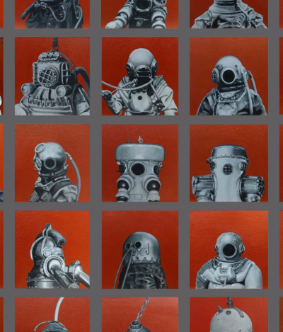
Image Text Hero
Required classes:
.grid-item - this is required and classifies the component as a grid item to snsure it knows how to behave on pages with or without a left nav.
.section--[classname] - each component has a unique class on the section that we have used to apply specific styles to the section around that component.
Modifiers:
grid-item--extend - use this to extend the component all the way to the right edge of the viewport.
.section--yellow - to add a yellow background colour
.section--grey - to add a grey background colour
.section--pink - to add a pink background colour
.section--brown - to add a brown background colour
.section--mint - to add a mint background colour
recommended images size:
1400 x 870
Virtual Tour
Since you can’t come and visit our campuses right now, this virtual open day experience will help you discover what it’s like to be a UCA student.
Take the TourLink Box
Required classes:
.grid-item - this is required and classifies the component as a grid item to snsure it knows how to behave on pages with or without a left nav.
.section--[classname] - each component has a unique class on the section that we have used to apply specific styles to the section around that component.
Modifiers:
grid-item--extend - use this to extend the component all the way to the right edge of the viewport.
recommended images size:
400 x 580
Link Box
Aliquam facilisis fringilla elit, nec venenatis nisl dapibus ac.
With Button
Link Box - Extended Example
Same as above, but showing an example using the grid-item--extend class.
Required classes:
.grid-item - this is required and classifies the component as a grid item to snsure it knows how to behave on pages with or without a left nav.
.section--[classname] - each component has a unique class on the section that we have used to apply specific styles to the section around that component.
Modifiers:
grid-item--extend - use this to extend the component all the way to the right edge of the viewport.
recommended images size:
400 x 580
Link Box Extended
Add the modifier class grid-item--extend to extend the section
Standard Content
Required classes:
.grid-item - this is required and classifies the component as a grid item to snsure it knows how to behave on pages with or without a left nav.
.section--[classname] - each component has a unique class on the section that we have used to apply specific styles to the section around that component.
Modifiers:
grid-item--extend - use this to extend the component all the way to the right edge of the viewport.
section--standard-content-highlight - use this to the section to change background colour to yellow
Our Industries
Your Journey
The opportunity provided at the Business School stretches far beyond our four walls; offering a range of specialist courses from across the Creative Industries, that support you throughout your academic roadmap and beyond.
A curious community with global awareness, socially conscious and entrepreneurial mindsets. The Business School offers the tools and resources needed to support you to achieve your creative and visionary goals. Engaging teaching and learning, industry experience and insight, building of transferable skills and the opportunity to network with potential employers, means our community are more than equipped with the opportunities to excel within the Creative Industry. We challenge traditional ways of thinking, exploring and building.
We are not just a school; we are a community.
Across all courses, our community are constantly engaging with new and contemporary landscapes. We believe that our students have the vision and creative talent to lead the next generation of thinkers and leaders. It is our job to assist you, to nurture, to challenge and to support you in your drive for a better future. We develop, empower and support the global thinkers and leaders of tomorrow.
We nurture our community to envision their creative future - to explore, to build, to grow.
Standard Content with Table
Same as above but showing an example with a standard table and the section--standard-content-highlight class.
Required classes:
.grid-item - this is required and classifies the component as a grid item to snsure it knows how to behave on pages with or without a left nav.
.section--[classname] - each component has a unique class on the section that we have used to apply specific styles to the section around that component.
Modifiers:
grid-item--extend - use this to extend the component all the way to the right edge of the viewport.
section--standard-content-highlight - use this to the section to change background colour to yellow
| Course | Age Group | Course Fee |
|---|---|---|
| National Extended Diploma in Art & Design Practice | 16-18 | £0 |
| 19+* | £4,290 | |
| National Extended Diploma in Creative Media Practice | 16-18 | £0 |
| 19+* | £3,695 | |
| National Extended Diploma in Art & Design Practice: Fashion Business Retail | 16-18 | £0 |
| 19+* | £4,290 | |
| Foundation Diploma in Art, Design & Media Practice | 16-18 | £0 |
| 19+* | £5,420 | |
| Access to Higher Education Diploma: Art & Design | 19+* | £3,928 |
*You will not have to pay fees if you are aged between 19-23 on the 31 August immediately preceding the start of the pre-degree course, and studying for your first full level 3 qualification.
All fees are currently correct, but may change as a result of changes in Government policy on tuition fees, entitlement to fee reductions and tax or benefit rules. Please check for the latest information before you enrol.
These fees are correct for the stated academic year only. Costs may increase each year during a student’s period of continued registration on course in line with inflation (subject to any maximum regulated tuition fee limit). Any adjustment for continuing students will be at or below the RPI-X forecast rate.
If you are joining UCA from the Channel Islands and Isle of Man you will be charged the overseas fee rate for your Pre-degree (FE) course. This is because you are ineligible for ESFA funding as the funding responsibility for your course remains with your own independent governments.
Two Column Content
Required classes:
.grid-item - this is required and classifies the component as a grid item to snsure it knows how to behave on pages with or without a left nav.
.section--[classname] - each component has a unique class on the section that we have used to apply specific styles to the section around that component.
Modifiers:
grid-item--extend - use this to extend the component all the way to the right edge of the viewport.
Fees for EU and International students
This fee information applies to UK and EU students for 2019 and 2020 entry. From September 2021 students from an EU or an International country will need to go to our EU and International fees and finance pages.
Tuition fees for previous years
We review our tuition fees and fee regulations each academic year, go to our full fee schedules and regulations page view the tuition fee schedules for previous years.
Arrow Link 3 column
Required classes:
.grid-item - this is required and classifies the component as a grid item to snsure it knows how to behave on pages with or without a left nav.
.section--[classname] - each component has a unique class on the section that we have used to apply specific styles to the section around that component.
Modifiers:
grid-item--extend - use this to extend the component all the way to the right edge of the viewport.
section--arrow-link-highlight - use this to add a mint (light green) background to the component.
section--arrow-link-wide - use this to make each link span the full width of the component (instead of displaying in 3 columns).
Careers in Fine Art
Lorem ipsum dolor sit amet, consectetuer adipiscing elit. In pede ligula, mollis id, pulvinar eget, placerat vitae, sapien. Aenean at urna ut mi egestas varius.
Arrow Link 1 column
Sanme as above but showing an example that uses the section--arrow-link-highlight and section--arrow-link-wide classes.
Required classes:
.grid-item - this is required and classifies the component as a grid item to snsure it knows how to behave on pages with or without a left nav.
.section--[classname] - each component has a unique class on the section that we have used to apply specific styles to the section around that component.
Modifiers:
grid-item--extend - use this to extend the component all the way to the right edge of the viewport.
section--arrow-link-highlight - use this to add a mint (light green) background to the component.
section--arrow-link-wide - use this to make each link span the full width of the component (instead of displaying in 3 columns).
Careers in Fine Art
Lorem ipsum dolor sit amet, consectetuer adipiscing elit. In pede ligula, mollis id, pulvinar eget, placerat vitae, sapien. Aenean at urna ut mi egestas varius.
Accordion
Required classes:
.grid-item - this is required and classifies the component as a grid item to snsure it knows how to behave on pages with or without a left nav.
.section--[classname] - each component has a unique class on the section that we have used to apply specific styles to the section around that component.
Modifiers:
grid-item--extend - use this to extend the component all the way to the right edge of the viewport.
Student Useful Information
Lorem ipsum dolor sit amet, consectetur adipiscing elit. Adipiscing etiam ac eu ut quis. Dolor ornare ultrices luctus cras blandit. Sagittis consequat lacus tellus donec orci. Amet mauris sodales massa, porta mauris. Quis porttitor elementum est arcu semper urna, odio nunc. Molestie ultricies sit pulvinar urna euismod. Ac ac ipsum ultricies pretium tristique risus rutrum iaculis augue. Consectetur ultrices urna augue orci accumsan suspendisse tristique. Id sapien eleifend tristique justo etiam aliquet egestas bibendum.
Faucibus arcu congue eget non. Cras ut et non dignissim eget scelerisque accumsan, viverra diam. Non arcu, nunc, nunc hendrerit nisl, amet, congue. Malesuada enim in nec non, et, at. Tincidunt cum nullam mauris ac quisque sit cursus nibh. Porttitor nulla sit elementum, etiam in volutpat. Hac nunc proin amet elit proin congue commodo id.
Split Content
Required classes:
.grid-item - this is required and classifies the component as a grid item to snsure it knows how to behave on pages with or without a left nav.
.section--[classname] - each component has a unique class on the section that we have used to apply specific styles to the section around that component.
Modifiers:
grid-item--extend - use this to extend the component all the way to the right edge of the viewport.
Apply Now
Lorem ipsum dolor sit amet, consectetuer adipiscing elit. In pede ligula, mollis id, pulvinar eget, placerat vitae, sapien. Aenean at urna ut mi egestas varius.
Programme specification
UK Applications
-
 4 November 2020
 10:00 (UK GMT Time)
 Online
-
4 November 2020
10:00 (UK GMT Time)
Online
-
4 November 2020
10:00 (UK GMT Time)
Online
-
Apply for fulltime study - starting September 2021
-
4 November 2020
10:00 (UK GMT Time)
Online
International Applications
-
4 November 2020
10:00 (UK GMT Time)
Online
-
4 November 2020
10:00 (UK GMT Time)
Online
-
4 November 2020
10:00 (UK GMT Time)
Online
-
Apply for fulltime study - starting September 2021
-
4 November 2020
10:00 (UK GMT Time)
Online
Lorem ipsum dolor sit amet, consectetur adipiscing elit. Adipiscing etiam ac eu ut quis. Dolor ornare ultrices luctus cras blandit. Sagittis consequat lacus tellus donec orci. Amet mauris sodales massa, porta mauris. Quis porttitor elementum est arcu semper urna, odio nunc. Molestie ultricies sit pulvinar urna euismod. Ac ac ipsum ultricies pretium tristique risus rutrum iaculis augue. Consectetur ultrices urna augue orci accumsan suspendisse tristique. Id sapien eleifend tristique justo etiam aliquet egestas bibendum.
Faucibus arcu congue eget non. Cras ut et non dignissim eget scelerisque accumsan, viverra diam. Non arcu, nunc, nunc hendrerit nisl, amet, congue. Malesuada enim in nec non, et, at. Tincidunt cum nullam mauris ac quisque sit cursus nibh. Porttitor nulla sit elementum, etiam in volutpat. Hac nunc proin amet elit proin congue commodo id.
Please note, syllabus content indicated is provided as a guide. The content of the course may be subject to change in line with our Student Terms and Conditions for example, as required by external professional bodies or to improve the quality of the course.
Book Now CTA
Required classes:
.grid-item - this is required and classifies the component as a grid item to snsure it knows how to behave on pages with or without a left nav.
.section--[classname] - each component has a unique class on the section that we have used to apply specific styles to the section around that component.
Modifiers:
grid-item--extend - use this to extend the component all the way to the right edge of the viewport.
Book Now CTA
Add the modifier class grid-item--extend to the section
UK Applications
-
4 November 2020
10:00 (UK GMT Time)
Online
-
4 November 2020
10:00 (UK GMT Time)
Online
-
4 November 2020
10:00 (UK GMT Time)
Online
-
Apply for fulltime study - starting September 2021
-
4 November 2020
10:00 (UK GMT Time)
Online
International Applications
-
4 November 2020
10:00 (UK GMT Time)
Online
-
4 November 2020
10:00 (UK GMT Time)
Online
-
4 November 2020
10:00 (UK GMT Time)
Online
-
Apply for fulltime study - starting September 2021
-
4 November 2020
10:00 (UK GMT Time)
Online
Course Info
Required classes:
.grid-item - this is required and classifies the component as a grid item to snsure it knows how to behave on pages with or without a left nav.
.section--[classname] - each component has a unique class on the section that we have used to apply specific styles to the section around that component.
Modifiers:
grid-item--extend - use this to extend the component all the way to the right edge of the viewport.
Advertising BA/BSc (Hons)
Course Overview
As part of our Business School for the Creative Industries, our BA/BSc (Hons) Advertising course at UCA Epsom offers you a unique opportunity to blend academic excellence with professional experience, taught by highly experienced practitioners with connections to some of the biggest names in the industry.
You’ll be encouraged to create fresh and attention-grabbing projects across a range of platforms, working collaboratively with students from other courses to bring them to life. You’ll build skills in critical analysis, research, production and communication and by graduation have high levels of creativity in art direction, copywriting and digital media.
You have the option to complete a Professional Practice Year as part of this course. This will give you the opportunity to develop your professional, academic and personal potential, equipping you to be confident and engaged in creative workplaces. These qualities are widely recognised by employers and a significant proportion of placement students nationally are offered graduate-level jobs or go onto postgraduate study.
| Length of study | 28 taught weeks, full-time. Or, four years full-time with Professional Practice Year. |
|---|---|
| Campus | UCA Epsom |
| Entry Requirements | 112 UCAS tariff points Click here for full details |
| Course Entry Options | September 2021 View term dates |
| UCAS institution code | C093 |
| UCAS Code | N561 |
| UCAS code for course with Professional Practice | N562 |
Accredited by:
Featured Articles
Required classes:
.grid-item - this is required and classifies the component as a grid item to snsure it knows how to behave on pages with or without a left nav.
.section--[classname] - each component has a unique class on the section that we have used to apply specific styles to the section around that component.
Modifiers:
grid-item--extend - use this to extend the component all the way to the right edge of the viewport.
recommended images size:
900 x 500
UCA's VADS image resource launches new website

Egestas convallis bibendum. Odio adipiscing
Testimonial
Required classes:
.grid-item - this is required and classifies the component as a grid item to snsure it knows how to behave on pages with or without a left nav.
.section--[classname] - each component has a unique class on the section that we have used to apply specific styles to the section around that component.
Modifiers:
grid-item--extend - use this to extend the component all the way to the right edge of the viewport.
recommended images size:
490 x 680
I really enjoy the way the tutors encourage nec tempor, enim amet tincidunt urna. Nam etiam praesent libero nibh at et commodo, volutpat mattis. Sagittis nec mi egestas tincidunt tellus enim.
Featured News
Required classes:
.grid-item - this is required and classifies the component as a grid item to snsure it knows how to behave on pages with or without a left nav.
.section--[classname] - each component has a unique class on the section that we have used to apply specific styles to the section around that component.
Modifiers:
grid-item--extend - use this to extend the component all the way to the right edge of the viewport.
recommended images size:
680 x 570

Gallery Slider
Required classes:
.grid-item - this is required and classifies the component as a grid item to snsure it knows how to behave on pages with or without a left nav.
.section--[classname] - each component has a unique class on the section that we have used to apply specific styles to the section around that component.
Modifiers:
grid-item--extend - use this to extend the component all the way to the right edge of the viewport.
recommended images size:
1100 x 620
Gallery Grid
Required classes:
.grid-item - this is required and classifies the component as a grid item to snsure it knows how to behave on pages with or without a left nav.
.section--[classname] - each component has a unique class on the section that we have used to apply specific styles to the section around that component.
Modifiers:
grid-item--extend - this class works slightly differently for this component. Here we use it to extend the component all the way to the left edge of the viewport on pages that don't have a left nav. This component will always be extended full width to the right.
recommended images size:
500 x 500
Note that all images in this component will appear cropped so that they fit into the grid structure. A square image is the safest size to use. Any size image can be display in hte modal.


Image Link
Required classes:
.grid-item - this is required and classifies the component as a grid item to snsure it knows how to behave on pages with or without a left nav.
.section--[classname] - each component has a unique class on the section that we have used to apply specific styles to the section around that component.
Modifiers:
grid-item--extend - use this to extend the component all the way to the right edge of the viewport.
section--image-link-3-col - displays with 3 columns of content.
section--image-link-4-col - displays with 4 columns of content.
Other Notes:
This component will always have a black background.
recommended images size:
325 x 420
Tuition fees, loans & financial information
From student loans to managing your personal finances, please select one of the option below for more information:

Big CTA
Required classes:
.grid-item - this is required and classifies the component as a grid item to snsure it knows how to behave on pages with or without a left nav.
.section--[classname] - each component has a unique class on the section that we have used to apply specific styles to the section around that component.
Modifiers:
section--big-cta--slim - use this to display a slimmted down verasion of the component.
Found the right course?
Lorem ipsum dolor sit amet, consectetuer adipiscing elit. In pede ligula, mollis id, pulvinar eget, placerat vitae, sapien. Aenean at urna ut mi egestas varius.
Take the TourBig CTA Slim Version
Same as above but using the section--big-cta--slim class.
Required classes:
.grid-item - this is required and classifies the component as a grid item to snsure it knows how to behave on pages with or without a left nav.
.section--[classname] - each component has a unique class on the section that we have used to apply specific styles to the section around that component.
Modifiers:
section--big-cta--slim - use this to display a slimmted down verasion of the component.
Found the right course?
Lorem ipsum dolor sit amet, consectetuer adipiscing elit. In pede ligula, mollis id, pulvinar eget, placerat vitae, sapien. Aenean at urna ut mi egestas varius.
Take the TourUnibuddy
Required classes:
.grid-item - this is required and classifies the component as a grid item to snsure it knows how to behave on pages with or without a left nav.
.section--[classname] - each component has a unique class on the section that we have used to apply specific styles to the section around that component.
Modifiers:
None.
Other notes:
This is a third party component that uses an iframe and it can't be styled or modified in any way.
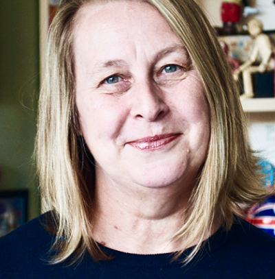
Staff Detail
Required classes:
.grid-item - this is required and classifies the component as a grid item to snsure it knows how to behave on pages with or without a left nav.
.section--[classname] - each component has a unique class on the section that we have used to apply specific styles to the section around that component.
Modifiers:
None.
recommended images size:
550 x 680
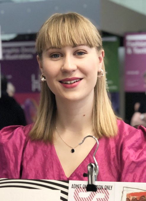
Laura Adburgham
Textiles Technician

Laura studied Fashion Textiles Design with Business Studies (specialising in Weave), at the University of Brighton, graduating in 2008 with First Class Honours.
Bio
At vel ornare sit volutpat arcu velit varius elementum mauris. Turpis egestas viverra vitae consequat adipiscing faucibus sit gravida. Libero, euismod massa egestas sit adipiscing tortor pellentesque diam. Ornare tincidunt consequat, malesuada quam eget. Laoreet neque sit orci eu viverra sed mi a. Ultricies pretium tincidunt est nisl id. Nec congue ornare eget quam justo, fringilla erat. Nibh sit hac enim commodo in. Euismod magna dictum aliquam nunc. A quam venenatis elementum ut mi, enim turpis.
Consequat, in consequat quam fusce ut. At in sem adipiscing aliquam sit turpis mauris est. Accumsan, ut id pellentesque urna pulvinar orci mattis vitae. Vestibulum aliquet eu neque vel in. Pulvinar massa suspendisse vitae convallis id quam ut scelerisque tristique.
Research statement
Lorem ipsum dolor sit amet, consectetur adipiscing elit. Vulputate sit ornare arcu elit aliquet pellentesque eu in lectus. Rutrum consectetur felis, ut pellentesque mauris. Diam dui mi gravida purus pharetra. Faucibus orci, in quis diam. Sollicitudin dolor et eget bibendum. Ac, scelerisque mauris eu, sit vel odio amet. Sit turpis habitant enim tellus odio eu viverra pellentesque mattis. Aliquet vulputate aliquam, euismod tortor consectetur diam lectus a. Tortor sed semper tortor, ornare sit netus.
Consequat, in consequat quam fusce ut. At in sem adipiscing aliquam sit turpis mauris est. Accumsan, ut id pellentesque urna pulvinar orci mattis vitae. Vestibulum aliquet eu neque vel in. Pulvinar massa suspendisse vitae convallis id quam ut scelerisque tristique.
At vel ornare sit volutpat arcu velit varius elementum mauris. Turpis egestas viverra vitae consequat adipiscing faucibus sit gravida. Libero, euismod massa egestas sit adipiscing tortor pellentesque diam. Ornare tincidunt consequat, malesuada quam eget. Laoreet neque sit orci eu viverra sed mi a. Ultricies pretium tincidunt est nisl id. Nec congue ornare eget quam justo, fringilla erat. Nibh sit hac enim commodo in. Euismod magna dictum aliquam nunc. A quam venenatis elementum ut mi, enim turpis.
I was extremely interested in the business behind fashion
Research supervision
Lorem ipsum dolor sit amet, consectetur adipiscing elit. Vulputate sit ornare arcu elit aliquet pellentesque eu in lectus. Rutrum consectetur felis, ut pellentesque mauris. Diam dui mi gravida purus pharetra. Faucibus orci, in quis diam. Sollicitudin dolor et eget bibendum. Ac, scelerisque mauris eu, sit vel odio amet. Sit turpis habitant enim tellus odio eu viverra pellentesque mattis. Aliquet vulputate aliquam, euismod tortor consectetur diam lectus a. Tortor sed semper tortor, ornare sit netus.
Professional Membership, Affiliation and Consultancy
Lorem ipsum dolor sit amet, consectetur adipiscing elit. Adipiscing etiam ac eu ut quis. Dolor ornare ultrices luctus cras blandit. Sagittis consequat lacus tellus donec orci. Amet mauris sodales massa, porta mauris. Quis porttitor elementum est arcu semper urna, odio nunc. Molestie ultricies sit pulvinar urna euismod. Ac ac ipsum ultricies pretium tristique risus rutrum iaculis augue. Consectetur ultrices urna augue orci accumsan suspendisse tristique. Id sapien eleifend tristique justo etiam aliquet egestas bibendum.
Faucibus arcu congue eget non. Cras ut et non dignissim eget scelerisque accumsan, viverra diam. Non arcu, nunc, nunc hendrerit nisl, amet, congue. Malesuada enim in nec non, et, at. Tincidunt cum nullam mauris ac quisque sit cursus nibh. Porttitor nulla sit elementum, etiam in volutpat. Hac nunc proin amet elit proin congue commodo id.
Research Outputs
Find links to all Camille's research outputs and activities available at UCA's online research portal UCARO